 The basic anatomy of a blog post, especially if you wish to keep it organized for easier reading for your readers as well as easier crawling for search engines, is to pay attention to how your post content and headings are written and styled.
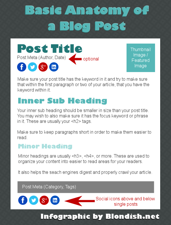
Your heading tags should always follow in order from largest being your post title with H1, the next with sub headings with H2, and even more minor headings with H3, H4, and so on. This gives the search engine and your readers an idea of the importance of order of each area within your post. For the readers, it also helps break up the text.
I’ve added a few other nifty tidbits in for you to think about with on your own blog article’s structure. For example:
- You may want to have social share buttons above an below your posts, or a way to keep your social buttons visible when sharing.
- It’s option to put the author name and the date of the post.
- The thumbnail image with a little integration can be picked up and posted with articles on several social networks.
Now, there may be a few that ask why I did not put the author box into this. This is the basic structure. Not all sites need an author box, but it really is a bonus and truthfully, your email address is normally what is used to connect with authorship type programs like the one Google has.
The other thing not mentioned are images. This is part of the content and not everyone uses images despite the fact that they could honestly use them as a means to make their post more visually appealing
Below is a short infographic illustrating the basic anatomy of a blog post.
Hi Nile!
Great Infographic. You are one of the few people I know who can make an Infographic by hand. 🙂
I’ll be sure to Pin this one too!
You are right ileane, This is such a great infographic.. I also tried one day but could not make it but now i will also try to create infographic at my website.. Thanks…
Thanks Ileane! Soon, you all will have access to Infographic designs that are PSDs, some free, but I’d like to put a premium package together as well. 😀
I’ve pinned your infographic. Such an well explained and easy one too.
I’m currently trawling sites to find some inspiration to get me blogging myself again after losing my “mojo” recently. This is certainly helping. Cheers!
The anatomy displayed in the infographic is 100% accurate .Tp blogs in the world have the same blog post structure as one shown in the picture . Thanks for sharing this amazing infographic Nile .
-Pramod
hi thanks for this article this post was awonderful one these will be kept in mind
Hmmm I never use minor headings,,,,maybe I ought to start,,, nice inforgrpahic Nile, resourceful as ever, Sarupa x
That’s a great infographic Nile. I just pinned it. Heading tags are so often overlooked and they really make a difference. When I first started blogging, I didn’t use them at all. Once I started incorporating them into my posts, I noticed that people started interacting more and staying on my pages longer. As you say, it really breaks up the text for your readers. It’s also a great opportunity to incorporate those keywords.
Well said as always Niles. I can so clearly remember when I first started blogging and trying to keep all the ‘must dos’ straight in my head. What’s funny is this week wrote a few guest posts for other blogs and the whole process of keywords, SEO and proper layout just felt so natural I had to laugh at myself. You can never really know how far you’ve come until you take a moment to reflect on where you started. 🙂
hi thanks for this article this was avery informative article which i will share with my friends and everyone
Hi Nile,
I always find the best info on your site for helping me to be a better blogger. Thanks so much for this useful infographic. I will share it with my social network.
I love a good infographic and while this one was short, it was also right to the point. A great reference for anyone just starting out or looking to improve their content.
Infographics are suppose to be short and to the point. A LOT of people have been using it incorrectly with long graphics that could be better used in well styled posts.
The illustrated anatomy is cool, but this may differ depending on the type of WP Theme one is using. Some Themes are so flexible while others do not give room for one to carryout major changes.
Nice tip. Enjoyed it
I’d have to disagree… this is not on the entire theme… this is specifically the blog post itself. And while you can move things around in a theme, the general anatomy of a blog post remains the same.
Cool infographic! The article is brief but concise too. Great resource for us bloggers, so thanks for sharing this Nile.
Cheers,
Mike
Hi Nile,
You explained the fundamentals of a blogpost. What is really interesting is that you said: “not everyone uses images”. I noticed few people who simply don’t use images. No images at all. I wonder why. Possible reasons:
a. They don’t know the importance of images
b. They don’t give a dam on images
c. This is a new trend (people got tired of beautiful but stupid images peppered all over the internet).
The infographic is not so nice but it is relevant and this is what matters.
Have a wonderful day
My blogging life would be much simpler if I didn’t have to look for just the right image, size it and place it in just the right spot in my blog post. But images add so much to the post that I’m always glad for the time and effort it takes.
Great little infographic of the most important points to remember.
Willena
If you ask me, you have already shared something that a noob can pick up to come over everything in today’s world. It is just an awesome piece, in understanding how to write a blog post, and as well as some myths about on-page SEO.
Nile,
Your infographic shows how simple it is to create a blog post that has all the needed elements. It doesn’t have to be complicated. I would love to know how you created the infographic. Did you use special software to do that?
Thanks,
Dr. Erica
I just use my own graphic editor and create everything myself.
Valuable infographic. I didn’t know that social share icons need to be below the post as well. I only have them at the top of the post. I am having issues with the featured image when I’m using my books image. They are cropped instead of showing a thumbnail version. Maybe the image is to big? Other images are shown fine, except for my book images. Sigh.
I don’t have mine at the top yet, but its because I’m not at the next phase of my site’s development… and that is one of the implementations I have on my to do list.
Pinned and shared Nile – great infographic and breakdown! I’ve also found that creating an image specifically for Pinterest and G+ (specs are the same) and using it as my featured image has increased shares dramatically.
Truthfully, the infographic’s social icons are just a representation of the fact you need them in general for your site. And definitely, using the social network icons that work best for your site, especially if you are trying to reach others, is great. Pinterest and Google plus are definitely ones I recommend.
I love your infographic Nile–short and to the point. I never thought to include my social media buttons both before and after my post. I work so hard to keep my blog minimalist that I may be missing share opportunities.
Nice, simple, clear infographic. I agree and write in this way. I do tend to ignore sub-headlines at times, though! I like that you included info about writing short paragraphs. Using lots of white space (with short paragraphs, bullet points, numbered lists and other things) is really important to make your posts more accessible for your readers.
Hi Nile,
great and to the point information.
Would you recommend to have the thumnail picture on the left?
I like your infographic which is a great visual of what you are teaching!
Thank you for sharing this!
Yorinda
It doesn’t matter as long as your theme functions well. Personally, I like to put a thumbnail on the right hand side within my single posts, but left on my excerpts. The reason- I’m assuming that the image and title did the trick for the reader since they saw those first on the excerpt, so within the single post, the thumbnail on the right is fine as I’ve already used it to convert. And for any clicking directly to the individual post from an outside source, they are there… it doesn’t matter as the image is near the top of the post.
Useful infographic for starters. Perhaps another one to add is the call-to-action at the end of each blog post, which will lead readers into the next step of your blogging objective. =)
It would if you’re trying to sell or get people to subscribe… however, this is not always a workable solution for every blogger. And often, it should be within the content, especially if the content is relevant to your call to action. Also, you have your sidebar too. So, the call to action for a basic blog post wouldn’t… but it would fit for the next step.
Useful infographic for beginners. Nice, simple, clear, short and to the point. 🙂
nice info-graphic and helpful tips. I think there should be Images / video section too.
I know not everybody use image in their post but its good practice to use image. What about the comment section? or number of comments/ preview below the post title?
Why… not everyone does videos… and that goes within the content anyway. Comment section is not part of the blog post… other-wise it would be “Anatomy of a Blog Template”
Hi Nile,
The Blog anatomy in the infographic is really fantastic. I am agree with all the points and will try to write in this way.
Have not used infographics yet but I can clearly see the value. I just need to find the time to develop the skills to create these presentations. Hmm, my wife is really good with this stuff so maybe I should get her involved. Thanks for all the other tips, too.
This is a really helpful infographic for new bloggers, especially, Nile.
Too many posts have no structure at all and it’s very confusing for readers.
We don’t have to keep to a stifling structure, but the basic one you’ve illustrated here is a really great blueprint for blogging successfully… and meaningfully.
This is very simple, nice and easily understandable info-graphics. Really very very useful.
Very very informative infographics. I have used infographics one time and found its the best ways to explain everything in detail.
Hi Nile!
Great Infographic. You are one of the few people I know who can make an Infographic by hand. 🙂
Now I am going to create infographic for my website.