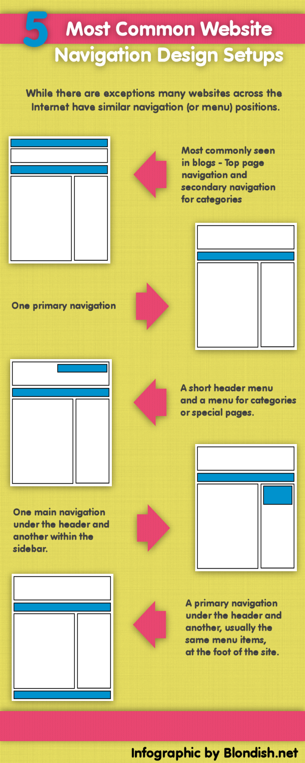
 The menu of your site if extremely important. It’s available to help direct your website’s visitors to the areas of your site that are most important. Each website has its own unique structure in terms of the content, but the general placement of the navigation menu is the quite similar to many other sites. Throughout the years, this has stayed somewhat the same, even with fad themes that were common with website owners in the blogosphere.
In fact, the navigation menu is sometimes a hard area for a lot of web page owners to put together. And sometimes even a professional web designer doesn’t always understand the importance of how a navigation should be set up.It might be because of the right order, or trying to decide what pages should be first and foremost, especially if they have a website that has a lot of static pages or blog posts.
Throughout the years, I’ve taken the time to see thousands of websites, both small and large, popular, and just starting, have a lot of common design in regards to just navigation design, at least in its placement on the web page.
Of course, there are sites that don’t march to the same tune, but they are also not part of the majority. That is quite alright too, as some menus work better for some types of websites, but don’t always work well on others.
Below is an infographics on the most common placement of website navigation menus.
Infographic: 5 Most Common Website Navigation Design Setups
Hi Nile,
The initial 2 navigation types are pretty common, and can be easily find on most of the sites. I personally feel that these 2 navigation designs are user friendly as well.
hi nile thanks for this wonderful article the main detailed points on the the infographic were quite genuine and fully understandable
Navigation is an important part of the website design. I love to keep it simple. A blogging website should be simple, but interactive. Internal linking is also very important for easy navigation.
Hello Nile,
The last one is the best navigation layout because it looks good and even in terms of SEO, the header need to be at the top and the navigation of categories should be below the header while the pages are situated at the end. Nice infographic.
The third style is pretty professional one and I like using that style as the other styles are very common among bloggers. Nice one Nile.
I definitely prefer sites that follow these popular design trends. They’re usually very easy to navigate and not confusing like the ones that try and go against the norm. I prefer the layout that has a top nav as well as a secondary nav below the header.
Nile, I have never really considered all the different navigation designs before. I do like visiting sites that are easy to navigate and not to cluttered with ads and other things. Thanks for sharing the different setups available.
The menu of your site if extremely important. It’s available to help direct your website’s visitors to the areas of your site that are most important. Each website has its own unique structure in terms of the content, but the general placement of the navigation menu is the quite similar to many other sites.
Navigation is an important part in any website because it helps the website to attract a lot of readers. A very valuable infographics and I like this too much. Thanks a lot@Nile for sharing this amazing infographics with us.
Yeah true… that’s the normal blogs design. Mine is the second one!
Hello Nile,
All the 5 Nav menu discuss above are the most commonly used one and yes agreed that different sited suits different king of Nav Menu. Over all the first one mention by you has been universal for me and works most of the time.
Nice post Nile back to you…
My view is that the first two designs are pretty common, but I still prefer them. I think the third one looks more professional. I’ll be care to try it in my next project
I like website layouts with the sidebar on the right.
I have been testing it on the left but, it just looks to strange and think it affected op-tins.
Going to change it back.
yes it was very helpful navigational performance of our blog, trimaksih have given some examples of good navigation for blogs. This makes my blog be better in the future.
yes it was very helpful navigational performance of our blog, trimaksih have given some examples of good navigation for blogs. This makes my blog be better in the future..
Good post: Short and concise–my kind of blog post. I think that is why I like infographics so much.
It also serves as a reminder to me that I was thinking of adding a navigation menu to my footer also.
Thanks!
Nice post! Iiked the way you presented your post. Thanks for sharing such a wonderful article..
Great graphic Nile! It’s interesting to see the differences between each layout. There are so many factors that play into a great website and so many reasons readers keep coming back. Layout is definitely a big one!
Hello Nile,
Thanks for your post. I have redesigned my menu follow your post and it look great! Thanks for sharing the different setups available, I’ll look for more useful tips from your site.
Hello Nile,
Great article nile…. mine is the Fourth one.. Happy Blogging thanks 🙂
What a great way to explain to clients what their options are – visually it’s so much clearer than trying to describe their choices without pictures.
Navigation is an important part of website design…..It is very useful & interactive…………@@Dehradun Diary
Maybe it’s a lot of people who write articles like this but the article that you wrote it easier for me to understand because of the shape of the image also
thank you for sharing knowledge about this.
I try to keep it simple and easy 🙂
I normally use a top horizontal menu with right sidebar but am now considering what is best for mobile content so will have to juggle a few things around on some blogs.
I prefer using Navigation menu below the main header as it helps users easily access parts of the website that otherwise are difficult to locate,
All of the navigation design are pretty common and I also use the same in my websites.Thinking of some changes.
Hi friend,
Read your post that was amazing regard infographic and The 3rd style is actually pretty professional one and I like using in which style because the other styles are extremely common amongst bloggers.
Thanks
navigation is important to attract traffic as any site and i always love navigation website. navigation makes beautiful website, so need all appropriate navigation to your site.
good post.I like website layout with the sidebar on the right.
i mostly like normal website format style but some websites format looking attractive so i mostly likes …..so your post according my thinking of website navigation format design…i like it so much….
thanks ….NILE
after reading this post about infographic I have to say that awesomeness redefined.
Nile, I have never really considered all the different navigation designs before. I do like visiting sites that are easy to navigate and not to cluttered with ads and other things. Thanks for sharing the different setups available.
Hi Nile,
The first two designs are the most common ones. I am using the first one on all of my blogs and websites.
Thanks for sharing this infographic with us.
This a news type navigation. But ya still most attractive and catchy. Nice share.
As I was going through the list I recognised every single one, heh! I wonder which is most effective? Looking at a redesign and trying to determine what sort of navigation works best for a photography business site.
Hi Nile,
Well, I have the most common website navigation and I think I might change it to something new now. Do you have a new idea for this that no one has used?
I think the last one would prove to be a good one for a travel website…what say???
Hi Nile,
Excellent post with nice examples. Navigation is a most important element in website designing. Visitors take more interests on those websites or blogs which have simple navigation.
Thanks for sharing such an excellent post.
hello nile
accoeding to me navigation is an important part of the website design. I love to keep it simple. A blogging website should be simple, but interactive. Internal linking is also very important for easy navigation.thnx for this nice information.
I’ve seen all of these navigation options and I’ve used a few of them. I currently use the last one. The key, really, is to make it simple and clear for your readers.
Hello Nile,
My view is that the first two designs are pretty common, and can be easily find on most of the sites. I’ll look for more useful tips from your site.
Nice blog post about how an interesting website should be Nice blog post with info graphic. Keep the good work going.
Thanks for this. I’m currently using a primary navigation for my website design.
Nothing wrong in using that. I use that as well.