Responsive design has changed the game for a lot of website owners. In fact, more people are using smartphones and tablets for surfing and shopping. According to Nielsen, over 70% of smartphone shoppers use a store locator before going out to that store. NPD says that in America alone, over 25 million people are using Coupon apps every month. There are so many mobile stats out there that websites have to conform to the times, and that means seeking a responsive design solution.
The problem is that while there are people realizing this and even trying to implement a solution, they are doing it wrong. Responsive design isn’t just letting your site resize to the width of the end user’s browser, but to smartly design it to make it an easier experience and help direct them to where you want them to go.
How Important Is Responsive Design For Website Conversion?
It is HUGE! Responsive design works hand in hand with the concept of web accessibility. Rather than forcing the user to download the entire bulky site in it’s full form, you are delivering a speedier and simple site to make it easier for anyone to view.
While a lot of areas offer great speed and bandwidth, because of the browser width, we can make the experience far more convenient.
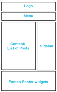
In most WordPress themes and in a lot of other types of websites, the design in general looks like the following image:
(You can click the image and it will open in a new window so you can view it in its entirety.)
You’re dealing with the logo, the menu, the content, the sidebar, and possibly footer or footer widgets. Sites that aren’t built to be responsive will show the whole website, but smaller. The user then has to zoom and scroll to view the content.
This has been the normal way to view a site for some time and while it isn’t taboo, it’s not as convenient.
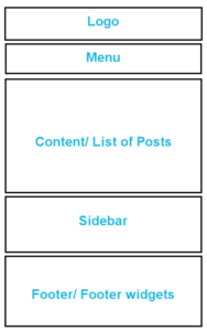
In most WordPress themes that say they are built with HTML5 and are responsive, in smaller tablets and mobile phones, the general design is rendered as:
(Again, you can click the image and it will open in a new window so you can view it in its entirety.)
As you can see, everything is lined up vertically in the theme. So, if you have 10 posts, a long sidebar, and 3 widgets, to the mobile user, the scrolling goes forever. This is an annoyance and your visitor won’t scroll for all of it.
So, if you’re implementing a responsive design for your website, what can you do?
Well, you can start by thinking logically:
- What do I want my visitors to do via smaller browser, especially if they are on the go?
- How will I implement a conversion strategy that will translate well to the mobile user?
- What design elements can I keep or get rid of in smaller browsers, but not sacrifice brand recognition?
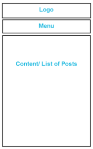
If your site relies on blogging, you might want to cut out the sidebar and some footer widgets. Just keep the logo, the menu, a few posts, and footer. You might want to only allow one widget from your sidebar to appear, like an optin form. Or you can make sure the optin form appears in single posts or pages.
Here’s a modified wire frame version of what a true mobile responsive site should look like:
(Once more, you can click the image and it will open in a new window so you can view it in its entirety.)
The goal is to cut out all the fat and get to what matters. People won’t even bother to scroll down to see those sidebars and footer widgets unless it is one single simple one with a purpose. You may not want to include the full excerpt of a post. Instead, you could possibly use the title of your post, and a small thumbnail image.
If your website is an e-commerce store, or any type of site, another solution is making an app. There are some solutions out there, but if you’re using WordPress, AppPresser would be a great place to start. It does cost, but you can create mobile apps easily using their plugin and their service in conjunction with WordPress.
If you don’t want to mess with making a mobile app, you can turn to using some plugins. They are quick mobile solutions for WordPress and will do an fair job to replace having to deal with responsive deal. Here are some WordPress plugins for mobile browsing:
I wrote some articles over on Verpex for both WordPress mobile plugins, and even turning your WordPress site into a mobile app:
How to Make Your Website Mobile Friendly in WordPress
How to Turn a Website into an App (using a WordPress Plugin)
Remember that your goal is to gain subscribers, commentators, followers, and ultimately buyers. So, if you’re seeking a responsive solution that converts, take some of the tips above to thought or you’ll miss out.
Is your site responsive? Is so, do you have any other tips?

I am a great fan of responsive websites as the website works perfectly fine on multiple devices and browsers. The one point I do like to add is the placement of CTA buttons. The Call-To-Action button needs to be placed above the fold and in the best visible spot so visitors can take the conversion action quickly. All the mentioned points are really useful. Grateful for sharing such amazing tips on creating responsive websites.
Unfortunately, not all CTA above the fold work in the responsive world, so you have to rely on good copy to get them to scroll in some device-widths. I do agree with you on this as it’s a method that’s been embraced since the newspaper was the way we got our information. However, things have changed some, where even in heatmap testing on websites, we’re finding different behavior from users. Some sites, in some niche, are even veering away from the trendy large front page header images.